JADE Course Management System


BACKGROUND
MyCourses is an online course management system used by college institutions all over the country, and allows students to view course content, submit assignments, and connect with professors and their peers. However, shortcomings within the system often inhibit a student’s ability to efficiently utilize the software. In this project, our team goal was to redesign and improve upon the current MyCourses functionality to create a better overall experience for students.
STEP 1
Identifying the project goals
Clear navigation
Navigating the current system isn’t intuitive. By adding a side navigation panel, students are able to immediately access courses and materials with ease.
Enhance calendar
The current calendar isn’t informative or an effective tool. We wanted it to automatically load with courses and assignment due dates.
Call to action
Many of the pages have disorganized content and taking action on items isn’t intuitive. We improved the page hierarchy to streamline workflows.
General improvements
Providing students with effective tools to manage their course load will increase motivation and productivity.
STEP 2
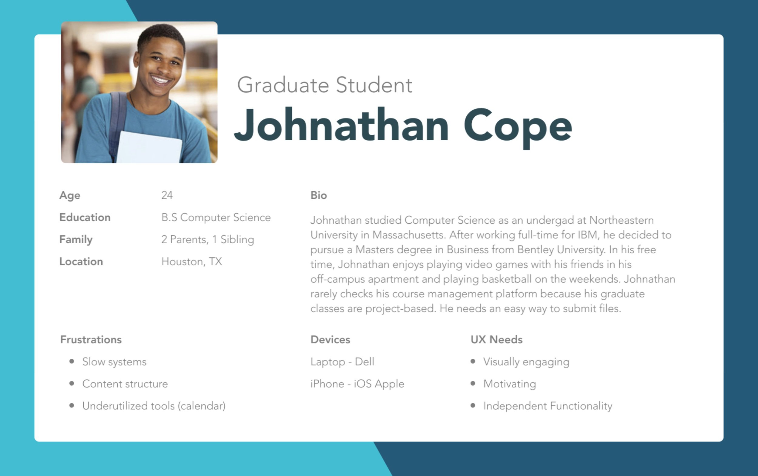
Conducting user research and defining our users
User experience research was conducted by all team members to better understand the user pain points within the current system. Our convenient sample of nine students was selected from different colleges, grade levels, genders, ages and majors.
-
100% visit MyCourses daily.
Most students interact with MyCourses regularly throughout the day with the high traffic times being during the afternoon and evening.
-
66% have a neutral opinion overall
The majority of students interviewed say that MyCourses isn’t the best or the worst courses management system, but all students said there were areas that needed improvement.
-
78% track assignments using MyCourses
Most students use MyCourses to manage their assignments. Other primary uses include tracking grades, participating in discussion posts and referencing class materials.


STEP 3
Designing a site diagram

STEP 4
Establishing style
With this being a group project, it was important to define our site’s style in terms of colors, typography and repeated components. We did this by designing a mood board and picked bright contrasting colors to differentiate between courses. We also created a logo for our site and named the site ‘JADE’, the first letter from each team member’s name.


STEP 5
Wireframing in Figma

STEP 6
Scaling for mobile
During our research, we found that many students use their mobile devices to check assignments and notifications. We wanted to make our designs scalable for the students who primarily interacted with the site on their mobile device. Some of the biggest changes were hiding the navigation behind a hamburger menu, minimizes content to ‘need to know’ and hiding additional content behind drill down components to maximize screen real estate.

STEP 7
Creating a working prototype
KEY TAKEAWAYS
Listen to the users
Redesigning a system in which we were already users was challenging. We had to step out of the mindset of users, and let go of our own fustrations and assumptions. This allowed us to uncover pain points unknown to us and gain a deeper understanding of our user base.
Teamwork
Throughout the redesign process, we had to learn how to work as a team. In doing so, we learned skills such as adaptabilty, collaboration, and compromise.
Accessibility
Our design relies heavily on color as a way to separate content, which can inhibit users with colorblindness from using our solution effectively. If our team were to back and redo the project, we’d include an addition indicator for more clarity.
Check out the full design deck below

TACKS iOS log in

New user onboarding
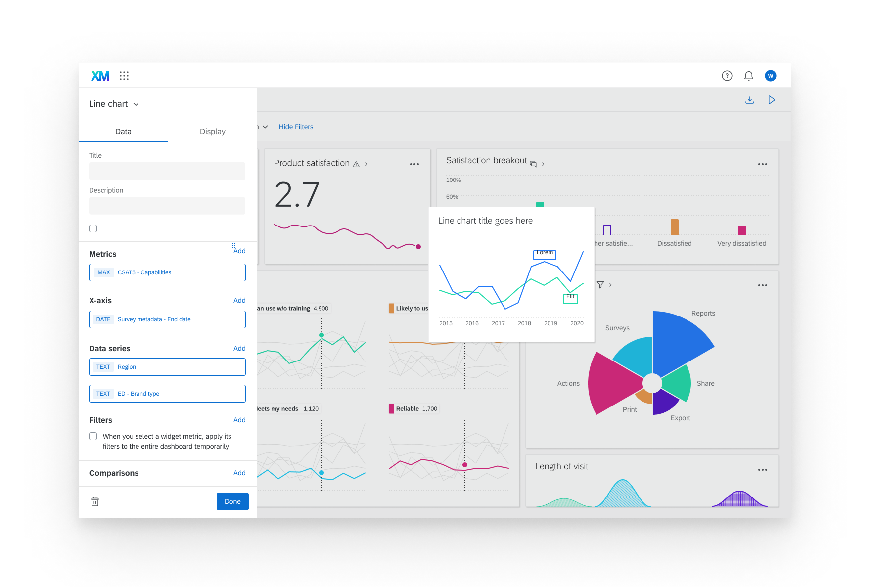
Visualization configuration redesign