Visualization Configuration Redesign


BACKGROUND
The Reporting Platform team is responsible for designing and developing our core dashboard. The reporting platform team also works with our four individual experience teams who utilize our dashboards and develop “specialty widgets” for specific customers. I joined the team at the beginning of the dashboard redesign initiative and was tasked with improving the visualization configuration experience. At that point, initial usability testing had been completed on high level conceptual mockups.
The redesign included 13 platform owned configuration panels and 5 experience team owned configuration panels thus far which equates to ~97% of widgets used in dashboards. At the conclusion of the redesign initiative, I designed and documented a framework as a reusable resource to help other designers and engineers looking to build configuration panels within the Qualtrics system.

What is a widget/data visualization?
A widget is the representation of data made up of common graphics such as charts, animations and plots. These visualizations are built and added to the dashboard by dashboard editors.
STEP 1
Identifying the problem space
Lack of consistency at the platform level and the experience product levels
Confusion of feature ownership among platform and experience team engineers
Legacy designs and flows not adhering to Qualtrics design system rules
Specialty visualizations have no foundation to build custom features off of
Development teams migrating from Angular to React hinders consistency
Disorganized or misplaced documentation explaining legacy design decisions
STEP 2
Reviewing the research results
Shortly before I joined the project, usability testing was conducted for different approaches of configuring data. One of my initial steps was to review the user testing procedure and results with the UX research team. Based on that meeting, I was able to identify a potential solution that tested well and begin working with the PM and engineering on feature priorities and outlining quarterly deliverables.
-
Which design performs best in a usability test, and which design do participants prefer?
Baseline (the current widget configuration panel)
Model 1 (multi-level design with “Metrics” and “Dimensions”)
Model 2 (tabbed design)
Model 3 (multi-level design with “Vertical axis” and “Horizontal axis”)
Which tasks do participants struggle with the most?
Is the terminology clear and intuitive?
How can we improve the widget configuration experience?
-
Model 2 (tabbed design) outperformed the other prototypes, and every participant who saw Model 2 preferred it over the baseline prototype.
Most terminology was straightforward and intuitive.
ON/OFF toggles are extremely user-friendly
-
Design config panel using Model 2 logic - separate data configuration from display configuration using tabbed approach
use ON/OFF toggles for optional features
Pair axis dimensions and use parallel labeling
Include the chart description with the chart title
STEP 3
Auditing the current experience
With the platform and experience product teams owning different widgets, it was important to communicate with all dashboard stakeholders to align on project goals and deliverables. I spent a lot of time in the product documenting inconsistent design and user flows. I also needed to understand where in the development process each team was. Our developers are moving from Angular to React and each team has their own timeline for accomplishing this. The new Qualtrics design system was built in React so teams still working in Angular don’t have access to new components or patterns.
STEP 4
Upgrading to the Qualtrics Design System

The first designs of many….
I started the redesign by updating platform owned widgets to be compliant with the Qualtrics Design System. There were no structural changes made at this time, but it created a universal starting point for all legacy widgets and new widgets in development.
STEP 5
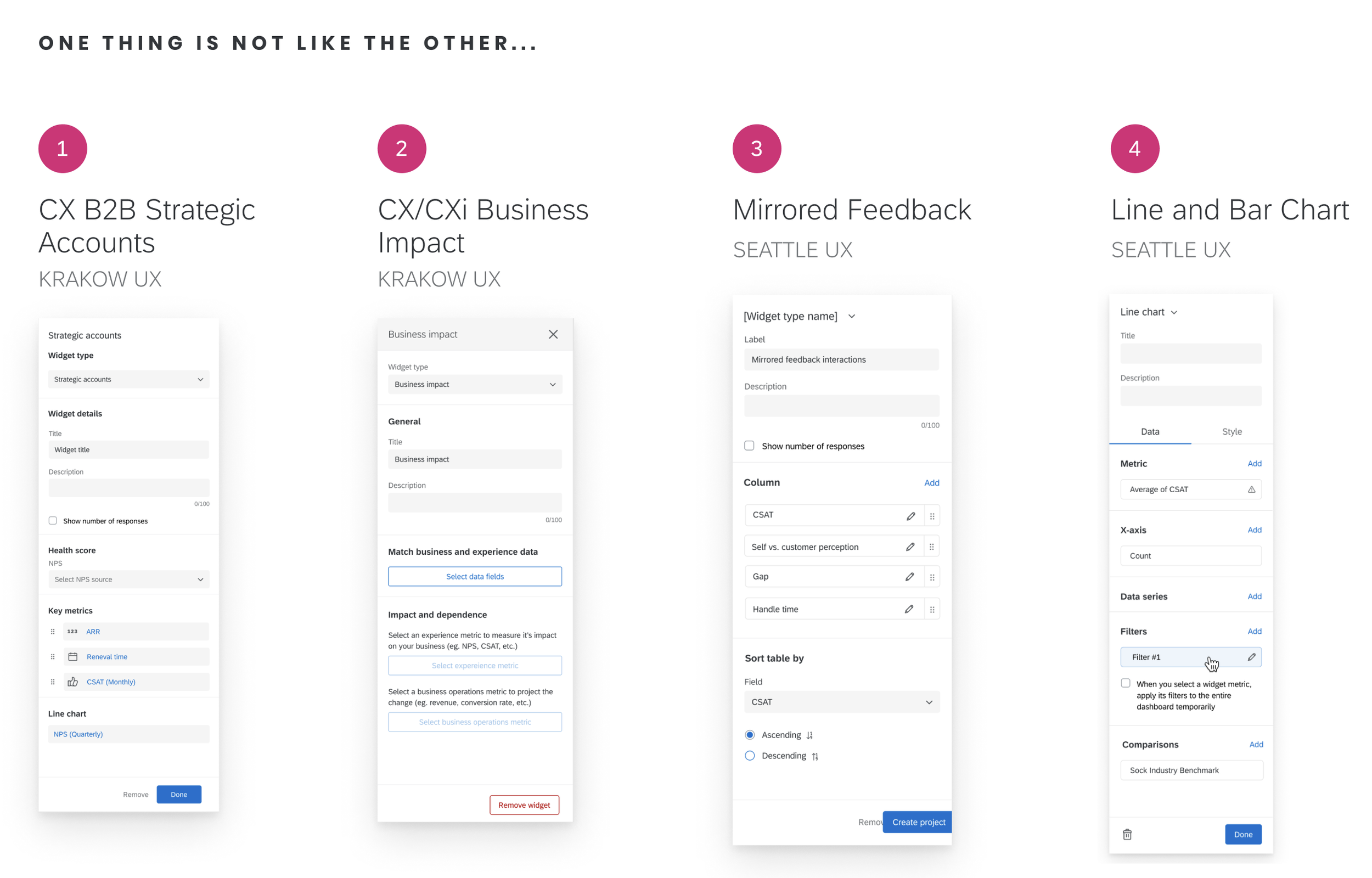
Redesigning the panel structure

DATA AND DISPLAY TABS
I separated the data configuration from the display configuration using a design system tab menu. This tabbed pattern performed the best in usability study and is consistent with competitor products.

REVEAL HIDDEN FUNCTIONS
Hidden functionality that was buried in flyout menus behind specific configurations was brought to the surface so the user can be aware of the widget’s flexibility.

ORGANIZE CONTENT INTO SECTIONS
I organized the data and display content into sections for easy scanning and to maximize screen real estate. Each section includes a header that is followed by related config for easy scanning.

CUSTOM PANEL COMPONENTS
I worked with our design system team to create a component that acted as a button and a label for complex configurations. The chip, when clicked, opens addition configuration in a flyout menu.
See what happens when you establish a framework…consistency
-

Simple Table
DATA TAB
-

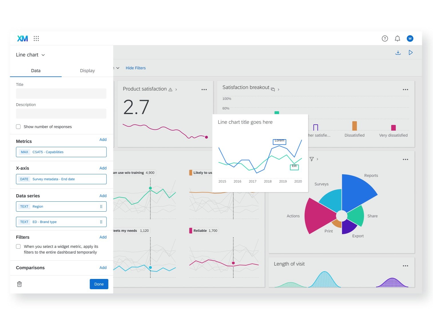
Line Chart
DATA TAB
-

Pie Chart
DISPLAY TAB
-

Word Cloud
DISPLAY TAB
Check it out in action
STEP 6
Let’s take this one step further
Being on a platform team, I realized that other designers and engineers who were currently building panels or would be in the future would still be designing from scratch. I started by documenting repeated patterns and best practices for panel design. I also included specs for custom components unique to visualization configuration panels. I compiled this framework into a Figma resource that could be shared with the design team and engineering. This work is now used as a source of truth for UX and eng who are building visualizations and has increased the efficiency of communications as it establishes an initial templated structure to build custom features off of.
I also partnered with our visualization expert to create weekly office hours where other designers or engineers can review their panel and visualization process work and make sure it is consistent with platform standards.

PART 1
The first page reviews the overall structure of the configuration panel, where it falls within the dashboard system and the building blocks used to construct a configuration panel.

PART 2
The next pages review different sections within a basic configuration panel. I explain how to use each pattern and the basic principles and best practices.

PART 3
In the third part, I break down the individual components that make up the different sections. Some components are derived from the Qualtrics Design System and other components were custom built for the panels. I redlined custom panel components for engineering reference.
Throw it all together and you have…
KEY TAKEAWAYS
Leverage it
Communicate with other teams, designers, engineers, PMs, etc to establish overlaps in the user experience within different areas of the product. You can often leverage an existing user experience and possibly make it better and more inclusive.
Advocate for it
Don’t be afraid to take charge of a project and maximize its reach. A seemingly small project that sits within a large ecosystem can influence other teams and future business goals.
Document it
Create a framework and document the rules and patterns that can be replicated for future related projects. This way, consistency is maintained across the product and the user experience is more intuitive and cohesive.

JADE course management system

TACKS iOS mobile log in

Article and author dashboards